Icon Anatomy
A Koder product icon is a 3D symbol where the form is the concept — no text, no frame — generated from a single master SVG and exported to every platform by the kicon tool, never hand-drawn per density. The normative rules live in icons/products.kmd and the per-platform export matrix in generation-targets.kmd.
An icon decomposes into four families of elements: geometric (the grid and its zones), visual (the form and the colour), layer (adaptive delivery) and metadata.
1. Geometric / structural elements
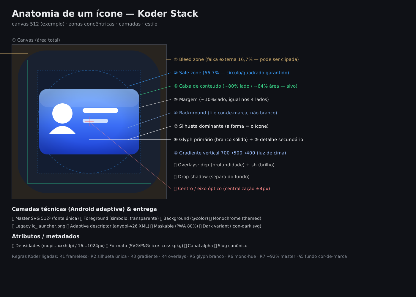
| # | Element | Description | Koder value |
|---|---|---|---|
| 1 | Canvas | Full icon area (coordinate system) | viewBox 0 0 512 512 |
| 2 | Live area | What survives the OS mask | varies by OEM |
| 3 | Safe zone | Centre region never clipped | 66.7% (Android); 80% (PWA) |
| 4 | Bleed zone | Outer band that may be clipped | 16.7% per side (Android) |
| 5 | Margin / padding | Band between art and edge, equal on 4 sides | target ~10%/side (§3) |
| 6 | Keyline shapes | Guide shapes that equalise optical weight | square/circle/rectangle |
| 7 | Centre / optical axis | Visual balance point (not the geometric centre) | centring ±4px |
2. Visual / content elements
| # | Element | Description | Rule |
|---|---|---|---|
| 8 | Dominant silhouette | The main form — it is the icon | R2 (a single one) |
| 9 | Primary glyph | Symbol naming the function (envelope, arrow, mic…) | R5 (solid white) |
| 10 | Secondary detail | Supporting elements | R5 (opacity 0.3–0.95) |
| 11 | Negative space | Void reinforcing figure-ground reading | favour |
| 12 | Dominant colour (hue) | Product brand colour | R6 (mono-hue) |
| 13 | Gradient | Colour variation giving light/direction | R3 (vertical 700→500→400) |
| 14 | Depth overlay | Depth/seating shadow | R4 (black 0→0.18) |
| 15 | Sheen overlay | Discreet gloss | R4 (white 0.12→0) |
| 16 | Drop shadow | Cast shadow separating from background | feDropShadow |
| 17 | Directional light | Coherent light source (from above) | R3 |
3. Technical layers (adaptive delivery)
| # | Layer | File / form | Content |
|---|---|---|---|
| 18 | Master SVG | icon.svg (product root) | single source, 512² |
| 19 | Foreground | ic_launcher_foreground.png | symbol, transparent background |
| 20 | Background | @color/ic_launcher_background | brand colour (not white) |
| 21 | Monochrome | ic_launcher_monochrome.png | white silhouette (Android 13+) |
| 22 | Legacy | ic_launcher.png | API <26, no layers |
| 23 | Adaptive descriptor | mipmap-anydpi-v26/ic_launcher.xml | binds bg+fg+monochrome |
| 24 | Maskable / Dark | icon-512-maskable · icon-dark.svg | PWA 80% · dark variant |
4. Family grammar (normative — R1 to R7)
| Rule | Definition |
|---|---|
| R1 — Absolute frameless | No rectangle/background shape covering the canvas in the master. The silhouette is the icon. kicon validate rejects a full-canvas background (hard error). |
| R2 — One dominant silhouette | Reduce to a single form. Forbidden: skeuomorphism, literal scene, multiple elements, thin line-art. |
| R3 — Gradient = light from above | Vertical linearGradient in userSpaceOnUse, 3 stops: 700 (base) → 500 (mid) → 400 (top). |
| R4 — Depth/sheen overlays | dep: black 0→0.18 (base). sh: white 0.12→0 (top). Both userSpaceOnUse. |
| R5 — White internal detail | Primary glyph solid white (#fff); secondary detail 0.3–0.95. Legibility floor 32×32px. |
| R6 — Mono-hue | One dominant hue per product. No polychrome accent (except the R3 traversal). |
| R7 — ~92% fill in master | The silhouette fills ~92% of the canvas (optical margin ±4%); kicon generate shrinks it for the adaptive foreground. |
5. Geometry — margin and area
The margin is a linear measure (a band per side). Converting to canvas area: a linear margin m per side leaves content of side (1−2m) → content area = (1−2m)².
| Linear margin / side | Content (% of area) | Background (% of area) | Typical use |
|---|---|---|---|
| 8% | 70.6% | 29.4% | Material legacy keyline |
| 10% (Koder target) | 64.0% | 36.0% | logo-in-tile (macOS / PWA) — sweet-spot |
| 12% | 57.8% | 42.2% | roomier alternative |
| 16.7% | 44.4% | 55.6% | Android adaptive foreground (anti-clip OEM) |
6. Generation — kicon
Every variant is generated from the master via kicon (never hand-rendered per density). Run kicon validate to enforce the R1–R7 grammar + safe-circle, and kicon generate for the per-platform outputs (Android mipmaps, iOS, macOS .icns, Windows .ico, Linux hicolor, web favicons, PWA maskable, store listing).
7. Inscribed glyph — figure inside a UI container (normative)
Chapters 1–6 cover the *product icon* (3D, launcher). This section closes the other plane: the *UI glyph inside a container* — circular button, tile, chip, pill. Full normative spec (formulas, keylines, T1–T4 tests): specs/icons/inscribed-glyph.kmd.
The problem has three objects: the *container* K (center C, margin m), the *figure* F (the set of inked points — fills and strokes counted at their thickness) and the *ink bounding box* B. Inscribing means satisfying three independent equalities: center of B ≡ C; scaled ink touching the usable limit K⊖m; and the same occupancy ratio across all siblings in a family.
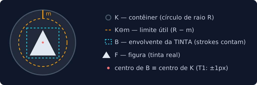
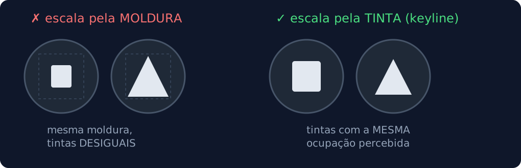
*The rule that prevents 90% of defects: measure the INK, never the frame.* Two figures sharing a viewBox can paint extents 40% apart — at the same scale, a family shows visibly unequal glyphs. The protocol, in order: measure ink → center within the frame → scale by the container → compose → optical adjustment (if asymmetric) → measure back.
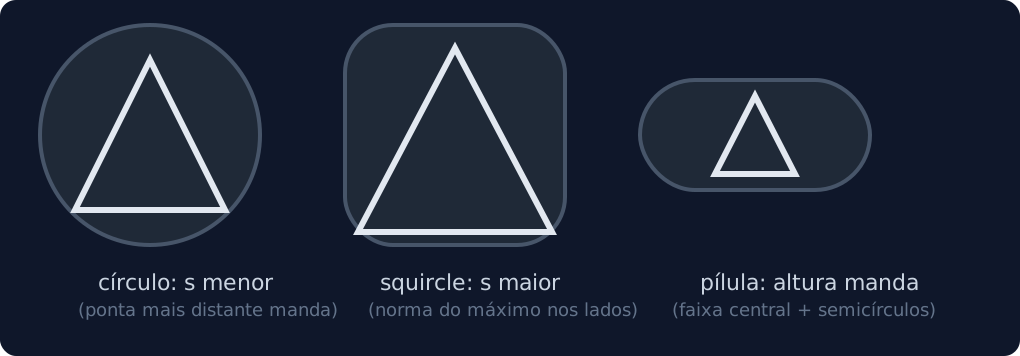
The maximum scale depends on the *container's shape* (general formulation: Minkowski functional of the margin-eroded container). In a circle, the ink point farthest from the center rules; in a square/squircle, the largest coordinate; in a pill, the central band height:
For heterogeneous families, consistency uses keylines (as Material/SF Symbols do): target extents per bounding-box proportion — square 0.82, portrait/landscape 0.90 on the dominant axis, circular 0.86 — compensating each shape's perceived mass.